


Recruiters face endless data from applicant tracking systems, spreadsheets, and reports. This overload creates confusion instead of clarity. Teams waste hours compiling numbers for leadership meetings. A recruitment dashboard solves this problem. It turns raw data into visual insights for quick decisions. In this guide, you will see real recruitment dashboard examples, the KPIs that actually matter, and most importantly, how to read each dashboard to decide what to fix next. If you are tired of rebuilding Excel charts every Monday for the CEO, this is your command center.
Why a Recruitment Dashboard Matters
A recruitment dashboard shifts talent acquisition from explaining the past to managing the present.
Instead of stitching together static spreadsheets after problems occur, a dashboard surfaces pipeline movement, recruiter activity, and cost signals while there is still time to intervene. It helps recruiters identify where candidates drop-off, managers spot workload or follow-up issues before requisitions stall, and executives understand how hiring velocity and cost trends affect business outcomes.
Used correctly, a recruiting dashboard becomes the operating rhythm of the hiring function, reviewed daily by recruiters and weekly at the leadership level.
Operational Recruitment Dashboards to Check Daily
These dashboards answer immediate operational questions and show where to act now.
1. Candidate Pipeline Dashboard
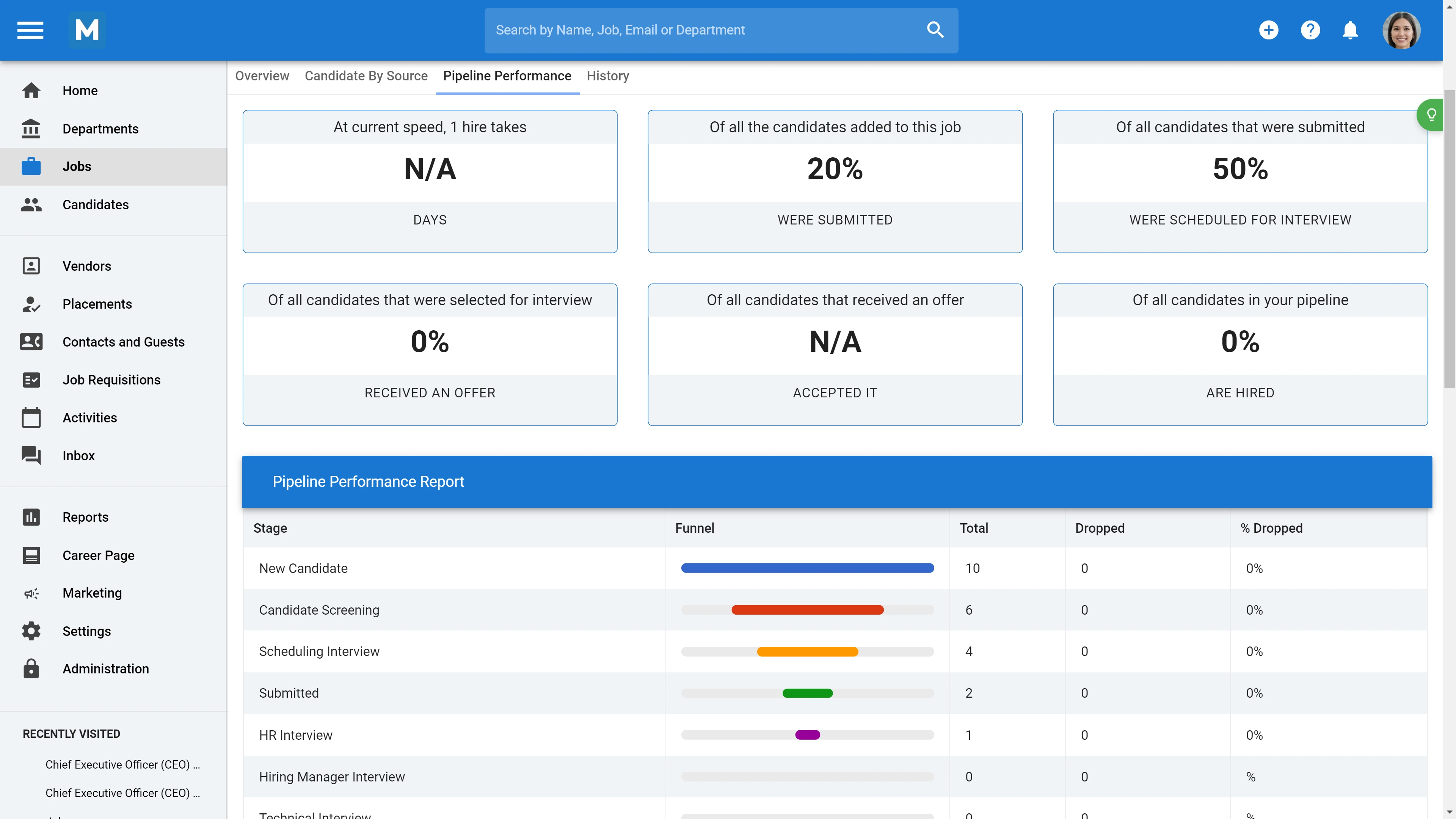
Key decision: Where are candidates getting stuck?
This dashboard shows candidates by stage (application, screen, interview, offer), conversion rates between stages, and drop-off points. It should be read as a funnel, not a headcount report.
What to look for: A sharp drop between the application and resume screen suggests poor sourcing quality or overly strict filters. A bottleneck between the recruiter screen and the hiring manager interview often signals unclear screening criteria or interviewer availability issues.
Benchmarks: Independent hiring funnel research indicates that only a small fraction of applicants typically reach the interview stage. For example, in competitive sectors, only about 2–3 % of applicants move into interview stages. Once candidates are interviewed, a modest share proceed to offers, with offer acceptance rates commonly ranging from ~70 % to 85 % across roles, highlighting steep early drop-off and selective throughput through later stages.[1]
Action: Audit the weakest stage by sampling 20 candidate records. Confirm rejection reasons and review stage-specific scorecards or templates for clarity.
2. Activity Dashboard
Key decision: Is the team actively moving the pipeline or just monitoring it?
This dashboard aggregates outreach, interviews scheduled, feedback submitted, and response rates by recruiter.
How to interpret it: Volume alone is misleading. A recruiter sending 80 messages with an 8% response rate is less effective than one sending 40 messages with a 25% response rate.
Action: Coach on quality, not quantity. Use response-per-outreach metrics to review messaging, targeting, and follow-up cadence.
3. Red Flag Dashboard (Candidates Stuck in Stages)
Key decision: Which candidates are about to disengage?
This dashboard highlights candidates with no movement or communication for a defined period, typically 7–10 business days.
Why it matters: Silence erodes candidate experience, lowers offer acceptance, and damages employer brand. This dashboard functions as an early-warning system.
Action: Trigger a simple workflow. Every flagged candidate receives a short update with a concrete next step and date. This takes minutes and preserves engagement.
Operational dashboards only work if the underlying data is live, standardized, and consistently updated. This is where a system like Manatal matters. With its Report and Analytics feature, you can customize your report to segment metrics such as time-to-fill, recruiter activity, or cost-per-hire directly from pipeline activity. The same dataset then powers recruiter dashboards and executive reporting from a single source of truth, without exports or manual reconciliation.
{{cta}}
Strategic Dashboards
These dashboards translate hiring activity into business outcomes. They are reviewed weekly or monthly by HR Directors, CFOs, and CEOs.
4. Cost and ROI Dashboard
Key decision: Where is hiring spend producing value, and where is it leaking?
This dashboard compares internal cost-per-hire, job board spend, and agency fees by role type.
How to calculate internal cost-per-hire: Divide recruiting team compensation and tools cost for the period by total hires. Use this number to compare internal delivery against agency-supported roles.
Action: Present the delta, not just the cost. Showing that internal hiring costs half of agency spend for certain roles supports headcount or automation investment decisions.
5. Workforce Forecasting Dashboard
Key decision: What roles are at risk next quarter?
This dashboard projects hiring demand using historical time-to-fill, current attrition, and open requisitions. A simple forecast compares days remaining against historical time-to-fill. Any role where remaining days are fewer than its historical time-to-fill indicates a pipeline capacity gap.
Action: Flag these roles early and adjust sourcing intensity or expectations before delivery risk becomes visible to leadership.
The Excel Trap and How to Escape It
Excel and Google Sheets are useful for prototyping; they break down when you scale. Typical failure modes:
- Formulas break after a careless column insertion.
- Concurrent edits overwrite rows.
- CSV exports misattribute hundreds of rows.
That time has a measurable opportunity cost. It could be redirected toward sourcing, stakeholder alignment, or process improvement. Platforms like Manatal’s Report and Analytics support this shift through configurable analytics and custom reporting. Teams can track pipeline flow, recruiter activity, and time-based metrics without exporting data or maintaining fragile formulas, freeing recruiters to focus on decisions rather than data hygiene.
Five Recruiting KPIs That Actually Move the Needle
Track these consistently, define them explicitly, and segment them by role type.
KPI 1: Time-to-Fill
Treat time-to-fill as a process diagnostic, not a single performance score. Break it into segments and review them side by side: requisition open to first sourced candidate, first sourced to first interview, final interview to offer accepted. This segmentation tells you exactly where speed is lost.
What changes when you manage it well: Teams that manage time-to-fill at the segment level stop debating vague “hiring delays” and start reallocating effort precisely. Sourcing intensity increases where pipelines are empty, interview scheduling is fixed where bottlenecks form, and leadership conversations shift from blame to capacity planning.
KPI 2: Time-to-Hire
Use time-to-hire as a candidate experience speedometer. Segment it by recruiter, role type, and hiring manager. Compare fast and slow pipelines to identify whether delays come from workload saturation, inconsistent screening criteria, or decision latency after interviews.
What changes when you manage it well: Shorter time-to-hire directly improves offer acceptance and reduces late-stage drop-off. Teams that monitor this KPI weekly intervene earlier, adjust recruiter capacity before burnout, and prevent strong candidates from accepting competing offers.
KPI 3: Cost-per-Hire
Track cost-per-hire by channel and role type, not as a blended average. Separate internally delivered hires from agency-assisted hires and review trends over time rather than isolated quarters.
What changes when you manage it well: Cost-per-hire becomes a budgeting and negotiation tool. Leaders gain the confidence to invest in internal capability, tooling, or headcount when data shows consistent cost advantages over external agencies. Procurement discussions become evidence-based instead of reactive.
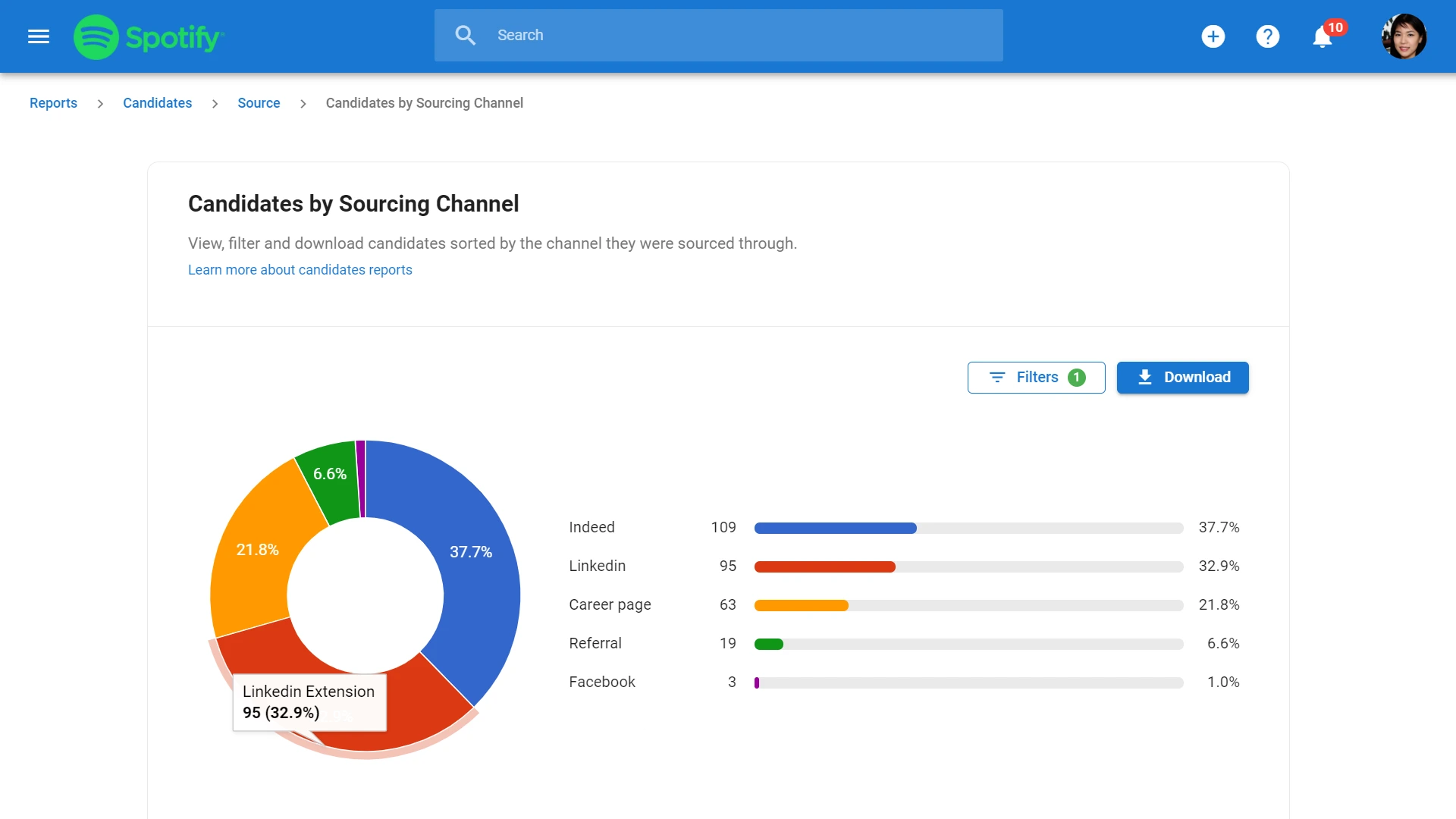
KPI 4: Source Quality
Measure source quality by linking hire source to 12–24 months retention and performance outcomes. Volume is irrelevant without downstream results. Review this KPI annually, not weekly, and use it to inform sourcing mix decisions.
What changes when you manage it well: Teams stop over-investing in high-volume, low-retention channels. Sourcing strategies become more stable, recruiter effort becomes more focused, and hiring managers see fewer early attrition cases tied to poor source alignment.
KPI 5: Offer Acceptance Rate
Monitor offer acceptance rate as a signal of market alignment. Track declines by reason and review patterns quarterly rather than reacting to individual rejections.
What changes when you manage it well: Acceptance rates above 80% indicate alignment between compensation, process speed, and employer perception. When rates fall, teams that act quickly adjust approval timelines, recalibrate offers, or fix communication gaps before reputation damage compounds.
Conclusion
A recruitment dashboard is not a vanity project. It is a management system. When dashboards are tied to clear decisions, reviewed on a fixed cadence, and backed by reliable data, hiring shifts from reactive reporting to proactive control. The teams that win are not those with the most data, but those that know exactly what to do when the numbers move.
Frequently Asked Questions
Q: How can a recruitment dashboard improve the hiring process?
A: A recruitment dashboard improves the hiring process by offering a centralized, real-time interface for tracking hiring metrics. It facilitates monitoring job openings, candidate progression, and recruitment channel effectiveness, helping to identify process bottlenecks and streamline communication. Clear visibility into time-to-hire and cost-per-hire enables data-driven decisions and more effective allocation of recruiting resources. Additionally, it enhances the candidate experience through timely follow-ups and consistent communication, aiding in attracting top talent.
Q: What key metrics should be included in a recruitment dashboard?
A: A recruitment dashboard should include metrics such as time-to-fill, time-to-hire, cost-per-hire, source of hire, applicant-to-interview ratio, interview-to-offer ratio, and diversity metrics. These provide insights into the efficiency, effectiveness, and inclusivity of the hiring process, enabling recruiters and HR professionals to make informed decisions and align hiring strategies with organizational goals.
Q: How do you customize a recruitment dashboard for specific organizational needs?
A: Customizing a recruitment dashboard involves assessing organizational goals, selecting relevant KPIs, and integrating data from various tools for comprehensive insights. The dashboard should be user-friendly with an intuitive layout and interactive elements for easy data interpretation. It's crucial to ensure flexibility, scalability, and regular updates with real-time data. Involving stakeholders in the customization process ensures the dashboard aligns with organizational needs and decision-making criteria.
Q: Can a recruitment dashboard integrate with other HR software systems?
A: A recruitment dashboard can integrate with HR software systems to streamline processes like applicant tracking and employee management. This integration reduces data redundancy, minimizes manual errors, and improves data accuracy, providing a unified view of employee and candidate data.
Citation
.webp)


.webp)


.webp)